Prerequisites
- Understanding how to configure components are on AEM pages
- Basic front-end development skills, not limited to HTML, JavaScript, Vue.js
[!TIP]
Using the CLP project as an example
The top level directory structure of an AEM project is roughly like this. Frontend component development mainly focuses on the ui.apps and ui.frontend directories:
1 | ├── all |
ui.apps
Component dialogs and metadata are defined in
ui.apps
In ui.apps/src/main/content/jcr_root/apps/clphk-postlogin/components, you can find declared AEM components. Their directory structure is:
1 | ├── _cq_dialog |
🔦 Define Component Dialog
-
_cq_dialogfolder defines the component dialog:-
-
The dialog pops up when clicking a component in the page editor for configuring component options.
-
①xml defines dialog structure including fields, labels, defaults etc. It follows JCR (Java Content Repository) to describe layout and functions.
-
<jcr:root xmlns:sling="http://sling.apache.org/jcr/sling/1.0" xmlns:cq="http://www.day.com/jcr/cq/1.0" xmlns:jcr="http://www.jcp.org/jcr/1.0" xmlns:nt="http://www.jcp.org/jcr/nt/1.0" jcr:primaryType="nt:unstructured" sling:resourceType="cq/gui/components/authoring/dialog" jcr:title="...DIALOG TITLE"> <items jcr:primaryType="nt:unstructured"> <tab1 jcr:primaryType="nt:unstructured" sling:resourceType="cq/gui/components/authoring/dialog/tabpanel" jcr:title="...TAB 1"> <items jcr:primaryType="nt:unstructured"> <field1 jcr:primaryType="nt:unstructured" sling:resourceType="granite/ui/components/foundation/form/textfield" fieldLabel="...FIELD 1" name="./field1"/> <!-- ...MORE FIELDS HERE --> </items> </tab1> <!-- ...MORE TABS HERE --> </items> </jcr:root>1
2
3
4
5
6
7
8
9
10
11
12
13
### 🔦 Define Component
- ② xml file:
- Defines AEM component metadata.
- ```xml
<?xml version="1.0" encoding="UTF-8"?>
<jcr:root xmlns:cq="http://www.day.com/jcr/cq/1.0" xmlns:jcr="http://www.jcp.org/jcr/1.0"
jcr:primaryType="cq:Component"
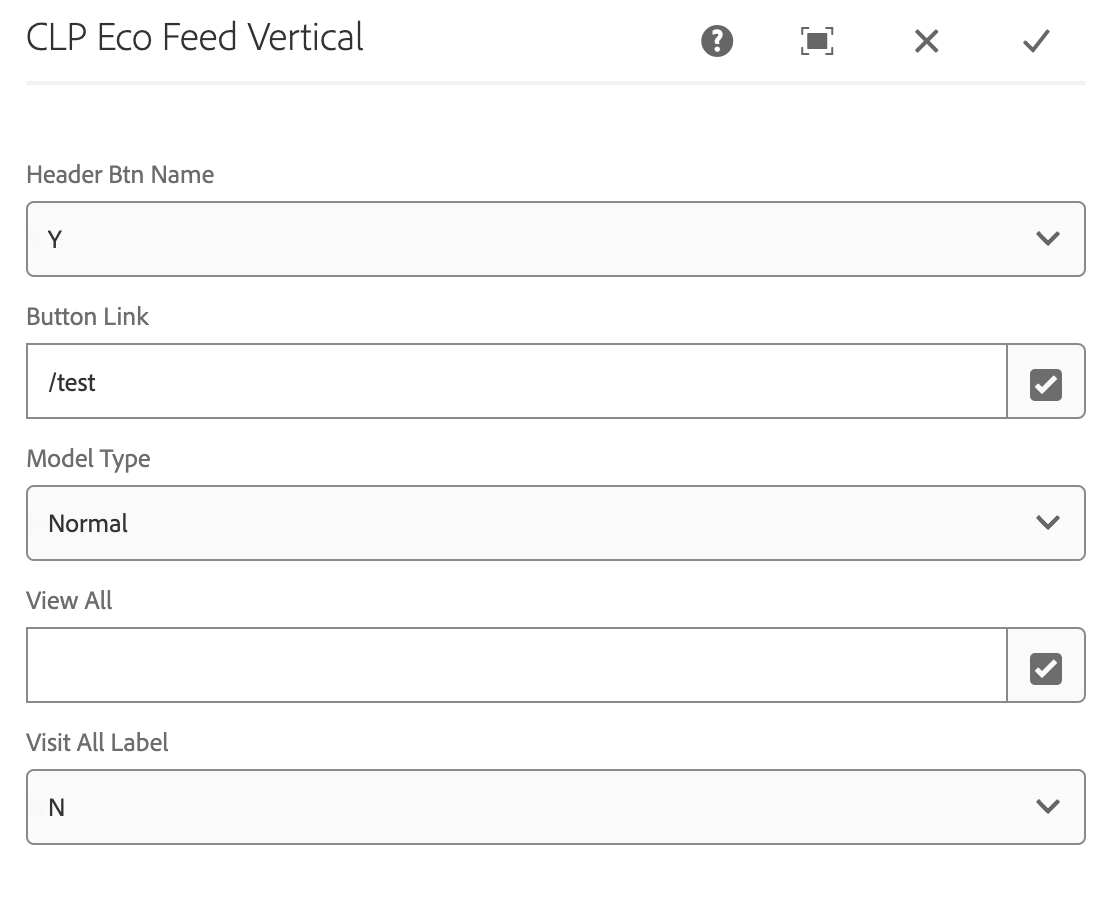
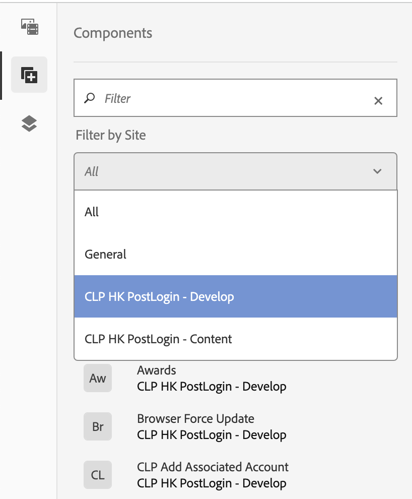
jcr:title="CLP Eco Feed Vertical" // Component title
componentGroup="CLP HK PostLogin - Develop"/> // Component group -
-
🔦 Define Component Template
The HTML file uses HTL (HTML Template Language) to render custom components in AEM pages (In this project, use Vue.js for joint development).
1 | <sly data-sly-use.templates="core/wcm/components/commons/v1/templates.html" data-sly-set.hasContent="${false}" /> |
ui.frontend
ui.frontendis built with webpack + Vue in this project
🔦 Write SFC (Single File Component)
- Write Vue components in
ui.frontend/src/main/webpack/vue/components(Please ensure to definenameattribute for reference in AEM).
componnents directorystructure
2
3
4
5
6
7
8
- common # common components
- components aem components
- elementui elementui components
- common
- components match aem naming
- utils common js libs
- main.js entryNotes:
- Register needed Element UI components in
_register/elementui.- Register new AEM components in
_register/components.- AEM components can use registered Element UI and common components.
🔦 Register Components
- Export Vue components in
ui.frontend/src/main/webpack/vue/_register/componentformain.jsto import and mount withcreateApp.component().
💡 Preview Components
Please configre the component on AEM page before Preview Components
For independent components
[!TIP]
independent components refers to to a component that is developed and previewed standalone, without associations with other components. For example, no need to navigate to other components or pages.
No need to bundle the entire
ui.frontend.
-
Mount defined component in
ui.frontend/src/main/webpack/templates/local.html:-
<div id="localApp" class="dtt-uf dtt-uf-vc dtt-uf-dc">
  <div class="dtt-uf">
    <div data-dom>
      <CustomComponent />
    </div>
  </div>
</div>
-
-
Run
npm run localand open browser to preview this component.“local”: “cross-env VUE_APP_MY_ENV=local webpack-dev-server --open --config ./webpack.local.js”
For associated components
[!TIP]
Need to bundle the entire
ui.frontend.
Option 1: Maven build
Universal but Time-Consuming Solutions
-
In project directoty, run
mvn clean install -PautoInstallSinglePackage. Then preview in AEM system.Production environment
For debug logs during development:
Comment out Terser plugin in
webpackprod config that removesconsole.log. Or use
window.console.log.
Option 2: AEM Sync plugin in VsCode
-
Install
AEM Syncplugin in VsCode. -
In
ui.frontenddirectoty, runnpm run dev. Plugin will sync build to AEM. Preview in launched server.“dev”: “webpack -d --env dev --config ./webpack.dev.js && clientlib --verbose”
Development environment